NFHS Network: The Streaming Site for High School Sports
Product Designer
Prototyping (Figma, Storybook)
User Surveys (Maze)
NFHS Network: The Streaming Site for High School Sports
Product Designer
Prototyping (Figma, Storybook)
User Surveys (Maze)
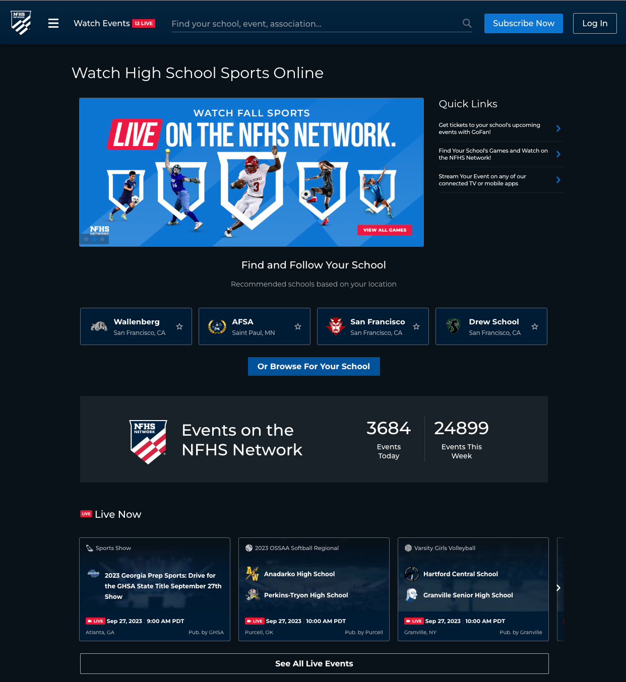
NFHS Network (the Network from here on in) is a website and suite of apps for streaming high school sports. They have 99% of high schools under contract - basically every public school district and almost all private school groups. It is the streaming platform for high school sports.
The product itself was built by a third party company out of Vietnam for another company. Then the product was purchased by GoFan, the company I worked with. Before I got to the project the engineering team had mainly spent time bringing the codebase into this millennium. The timing of my hiring worked out perfectly though and I stepped in the building as they finished tidying up that framework updates. We were ready to make some front-end magic happen.
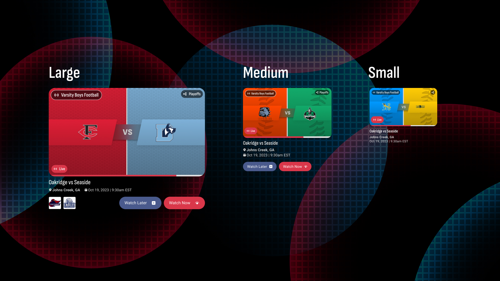
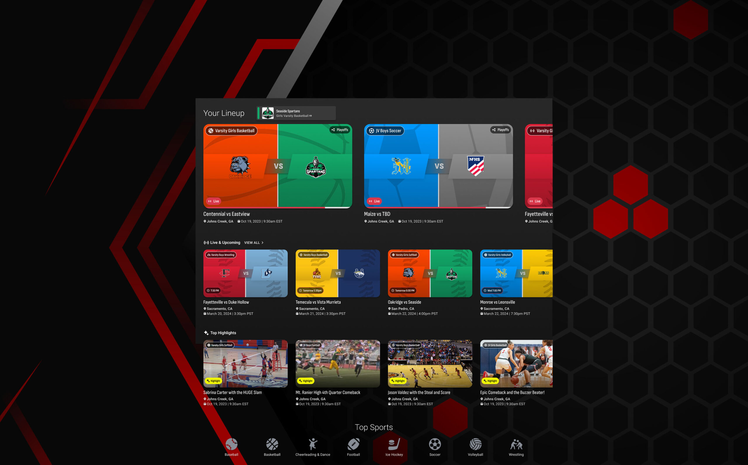
Not to oversell the importance of these cards, but literally the entire network relies on them on every device on every platform, so we wanted to take a little time to get them right. Whether you're logged in or not they are going to be the first thing you see unless you land directly on an event - and they are gonna show up there too.
So I've got to be honest here: absolutely one of the reasons GoFan hired me for this project was that I'm an unapologetic ex-jock who has some ESPN talk show playing in the background an embarrassing amount of time. I have an ex who called the ESPN app on my phone my side-chick. I'm one of four brothers and the right half of our childhood home could be mistaken for a Dick's Sporting Goods.
Now, I mention this because I had to be very conscious about the fact that I did not, in fact, know what parents of high school children wanted to see on event cards when they went to stream their child's game that they couldn't make it too. My junior designer did not, in fact, know what the grandmother of the quarterback wanted to see when scanning for this weeks game. We had a pretty good idea it turns out, but we wanted to validate our own instincts before pushing any valuable pixels.
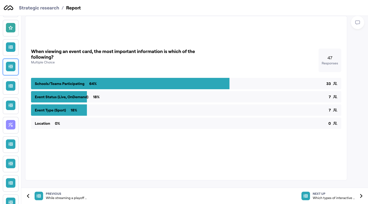
We went the traditional user interview route alongside a survey that we offered users upon login. One bit of feedback that was almost universal was that a redesign was definitely looked forward to! We took the positive spin bit of that the we were improving - but the bit that spoke to how bad it currently was did not go unheard.
Our biggest takeaways from both interviews and the Maze survey lined up with our initial thoughts which is always comforting. Most importantly we had our priorities literally in order in the eyes of our users.

Now it was time for the fun part. Well, to me at least, the most fun part: exploring, designing and prototyping time.
Our goal was to make this an effortless and familiar experience to our users. While our platform has specific needs based on content type, there are patterns in streaming apps and experiences that people have come to expect and our product needed to reflect that in it's design. Our exploration was pretty straightforward - explore streaming apps and platforms of all types, especially those in the sports space in any aspect.
After an exhaustive exploration stage, it was clear we needed to focus on three things to accomplish our goals: speed, clarity and accessibility.
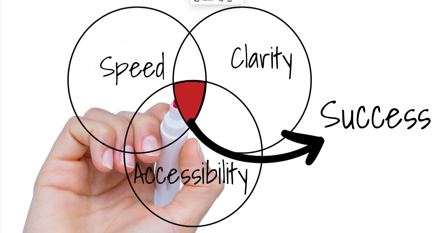
Speed and clarity were going to be tied very closely in their solutions in that both involved hierarchy of information in the event cards. Who is playing should be illustrated in a way that is instantly identifiable, event type needs to be illustrated, etc. Accessibility was going to be an organizational effort with collaboration between us and our engineers, so success was very much going to be a team wide effort.
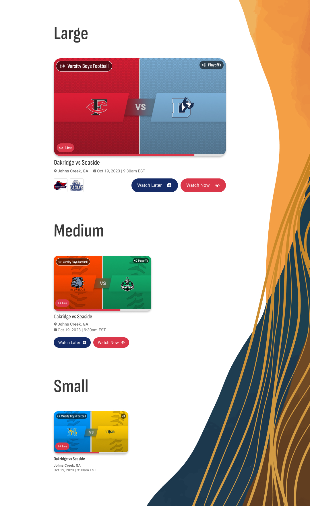
As we designed and experimented, we made small tweaks based on look and feel as we moved through the platform and all of the different states that event cards can be in. We were also putting into consideration the eventual use of AI on our dashboards (case study coming soon) and how that could eventually affect the cards. We had to keep this as modern and visionary as possibly while at the same time making it executable in our current state.
We also were designing for both dark and light modes even though this was also going to be a future update. At the moment everything was going to be dark mode, but our Storybook and future plans had light and dark modes in the works.
