NFHS Network: The Streaming Site for High School Sports
Product Designer
Prototyping (Figma, Storybook)
User Surveys (Maze)
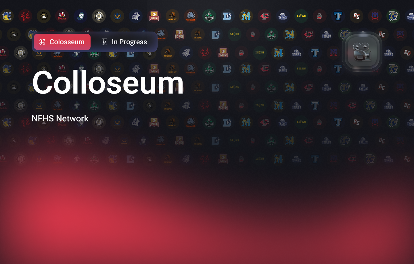
As the second portfolio item from the same project I'll let you check out the full project background if you're interested. The short version is that as a product designer my product is the NFHS Network, the largest high school sports/event streaming platform in the nation. They acquired the product and my job was to bring it into this century.
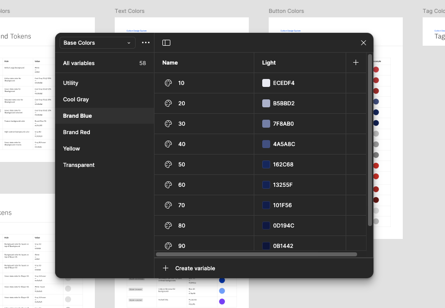
That being the case the starting point for this project was a bit different than most I've had in the past. There was a functional product in place with a "design" but it was being completely rebuilt (moving to React from Vue) and said design was not even based on the brand. I'm pretty sure it was a canned UI theme from somewhere. Fortunately for me it took a two minute conversation for everybody to be onboard with starting from scratch and building out a design system.
I could probably conjure up a good paragraph or two about why we chose the Carbon Design System - and don't get me wrong, it is a great system and it covers a ton of ground while being extremely flexible and extendable. It covers all the UI needs and doesn't get so granular that it solves problems that nobody ever has. Having built my own system from scratch before - it saved a ton of time getting up to speed quickly.
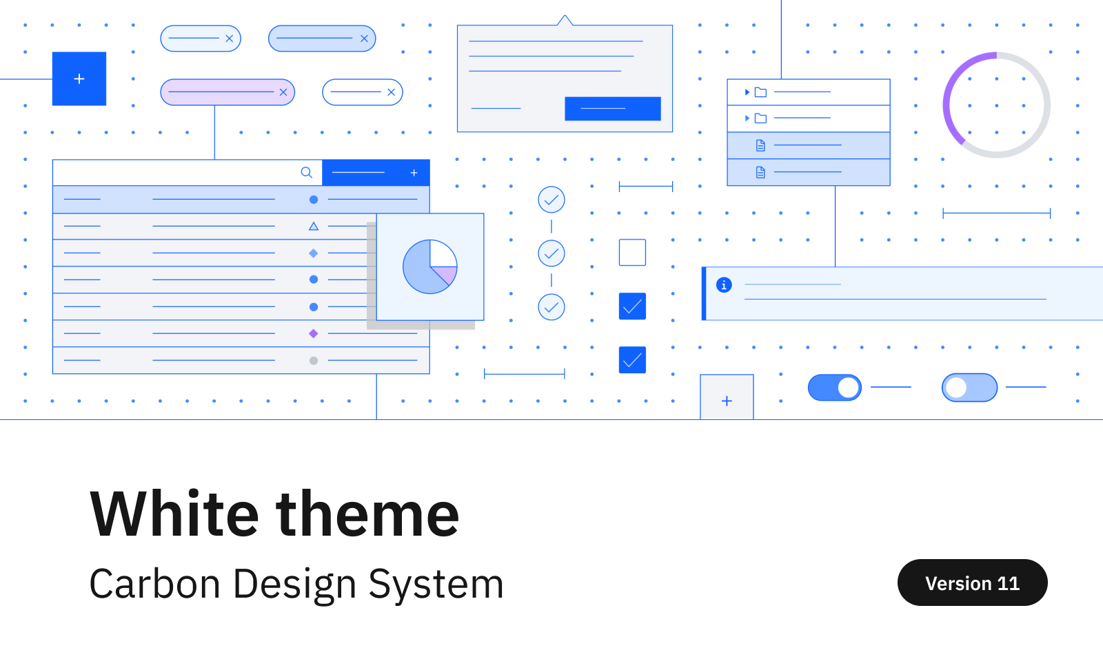
Perhaps most importantly - my Director of UX used to work at IBM and helped build the system ;)
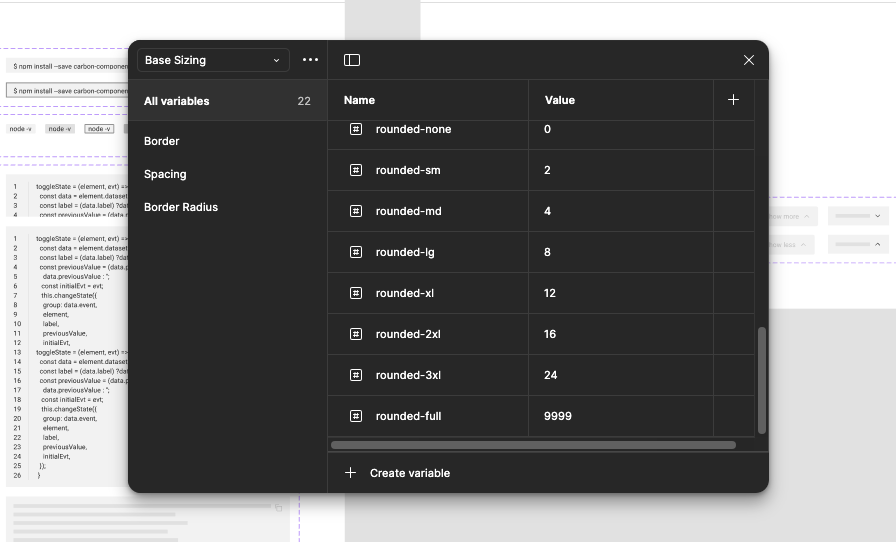
In my experience if you have a solid base with typography and color you can make just about anything work for you and this project was no different. We wanted something clean and simple and had a few things we knew we had to deal with for picking our fonts for this project.
Now here's the part where you can't just pick pretty fonts. Function over form came into play when selecting this header font for a very simple reason: some of these schools and tournaments have ridiculously long names. Think "Colorado Southwestern Polytechnic School for Boys vs. St. Thomas Aquinas School of Destiny" and they are playing in the "2025 Army National Guard Hoopball Boys Invitational for Cancer Research" (that is an actual tournament name).
The fancy term for how much horizontal space a font takes up is set-width and we needed the set-width to be as small as possible. With the lengthy names we were dealing with this was going to be the best way to keep overflow and multiple-line titles to a minimum. We narrowed it down to several options that the design team all agreed on then did the fun thing and had the company vote in a Slack poll! Naturally this ended in the top two basically being tied and one of those was my favorite so the decision was made. Drum roll please...
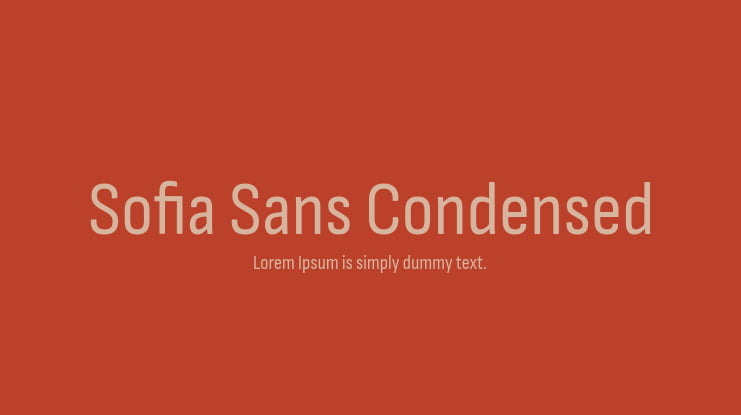
The fancy term for how much horizontal space a font takes up is set-width and we needed the set-width to be as small as possible. With the lengthy names we were dealing with this was going to be the best way to keep overflow and multiple-line titles to a minimum. We narrowed it down to several options that the design team all agreed on then did the fun thing and had the company vote in a Slack poll! Naturally this ended in the top two basically being tied and one of those was my favorite so the decision was made. Drum roll please...
With narrow proportions and a generous x-height, we drew a space-saving workhorse that would work well in very diverse environments: from large to small, for display and immersive reading.
Lettersoup (Font Foundry)