NFHS Network: The Streaming Site for High School Sports
Product Designer
Wireframing
Prototyping (Figma, Storybook)
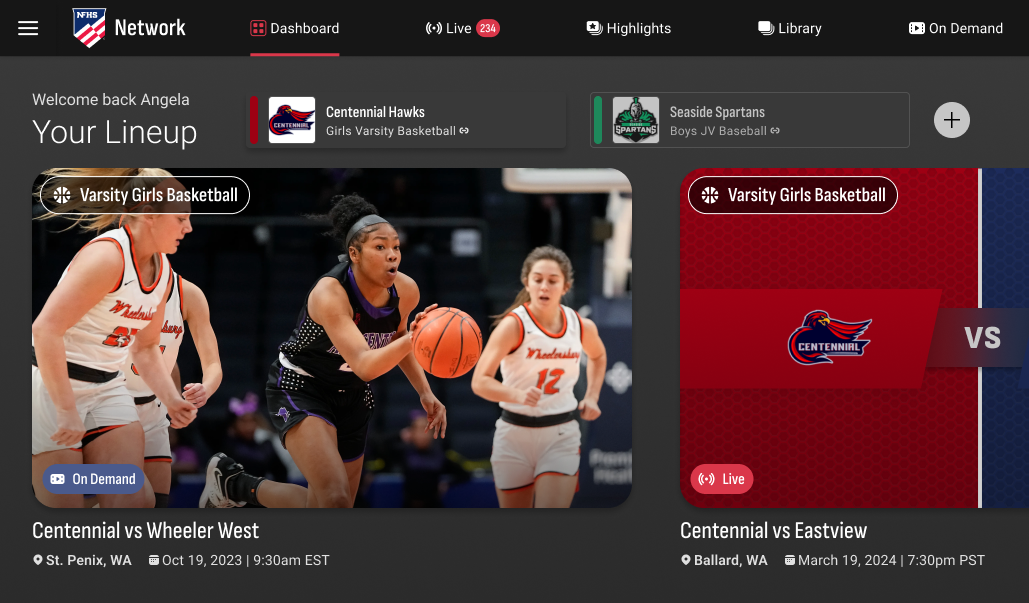
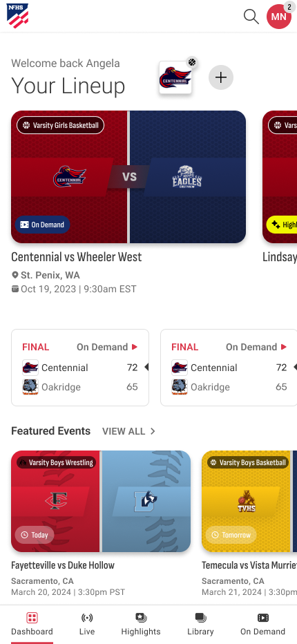
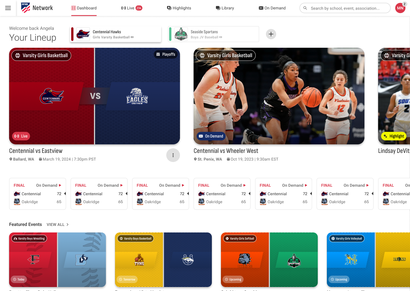
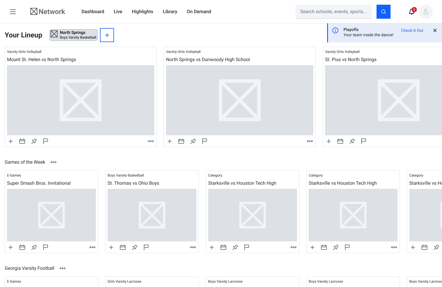
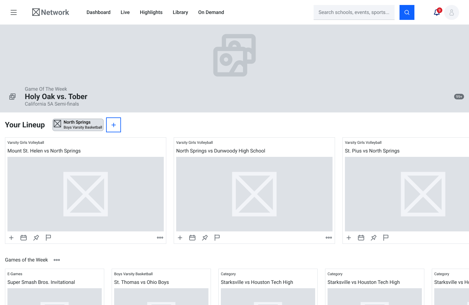
When we first acquired The Network, it was pretty clear the dashboard hadn’t been given much thought—which was surprising since it’s the first thing users see when they log into the app. Instead of anything helpful or tailored, you’d land on a random mix of games, simply sorted by time, which didn’t do much for anyone. With over 4,500 reviews on iOS and Android and an average rating sitting in the low 3s, it was obvious we had some work to do. The dashboard was the perfect place to start rolling out the new design system.
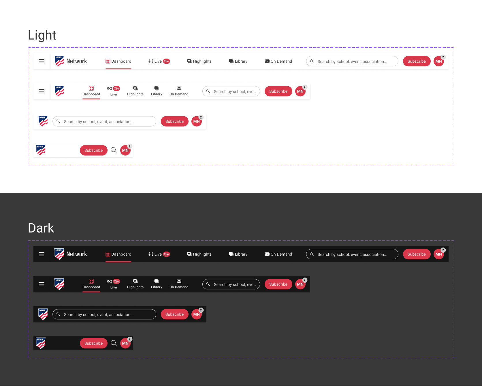
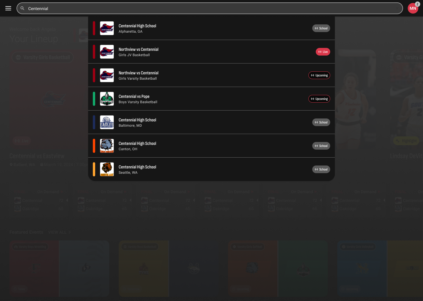
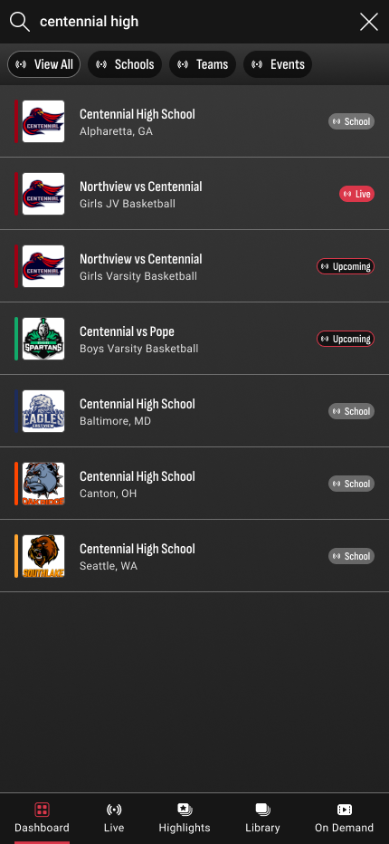
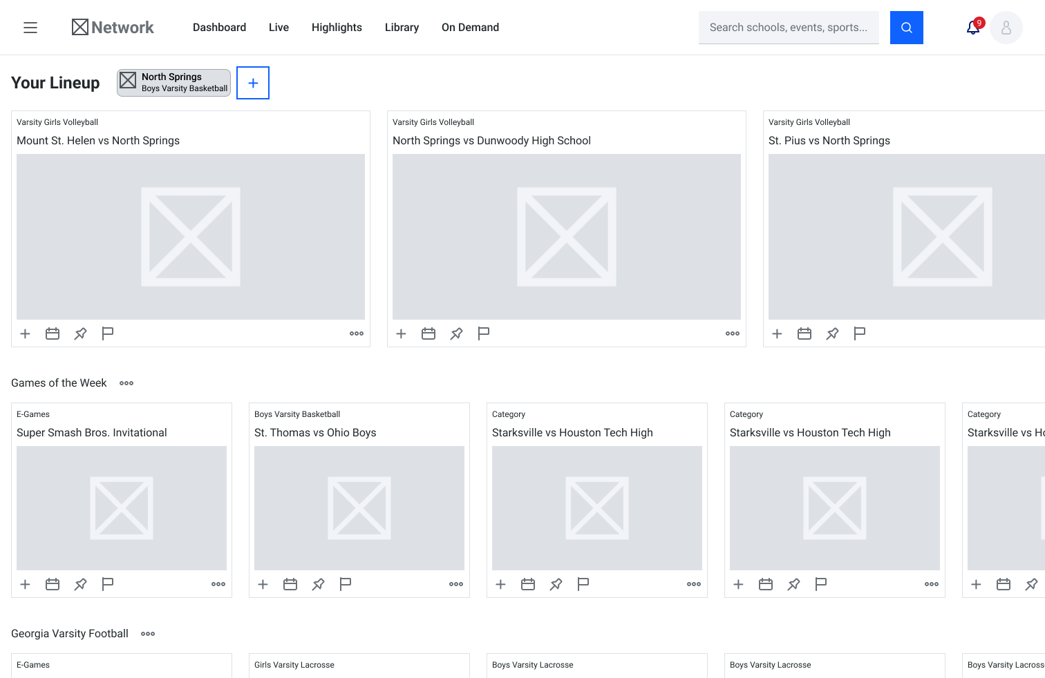
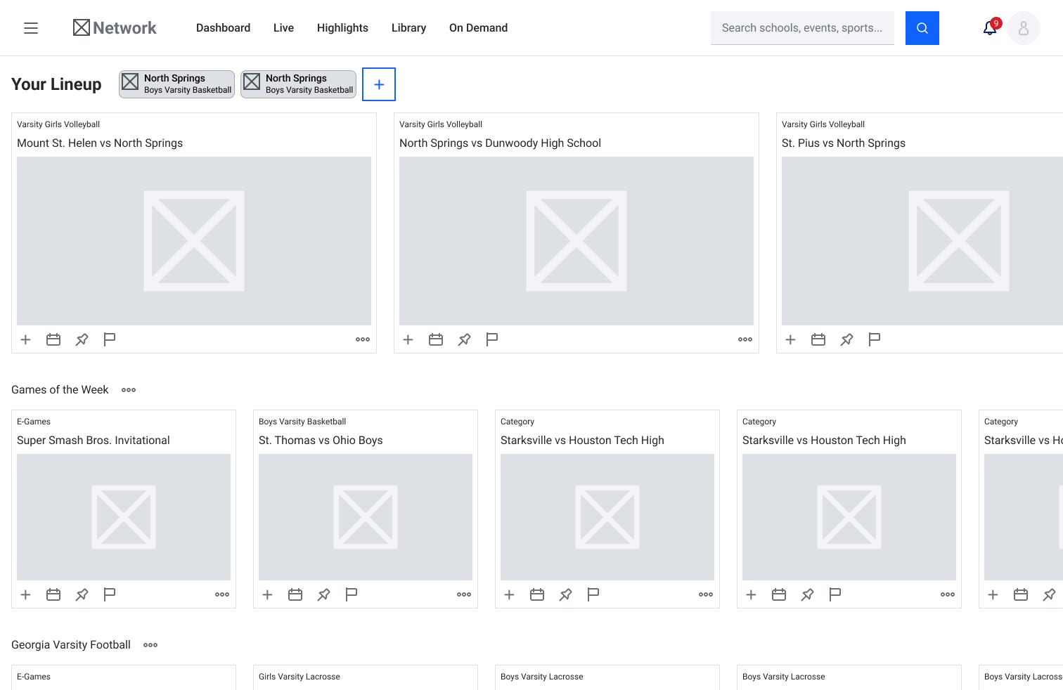
While working on wireframes for the dashboard we had to cover a lot of states. We had entirely different seasons to handle, playoffs coming and going, notifications to be given, the works. We used the wireframing stage to explore as many states as we possibly could. We did this so we could go back through and get rid of as many as possible!
While working on wireframes for the dashboard we had to cover a lot of states. We had entirely different seasons to handle, playoffs coming and going, notifications to be given, the works. We used the wireframing stage to explore as many states as we possibly could. We did this so we could go back through and get rid of as many as possible!
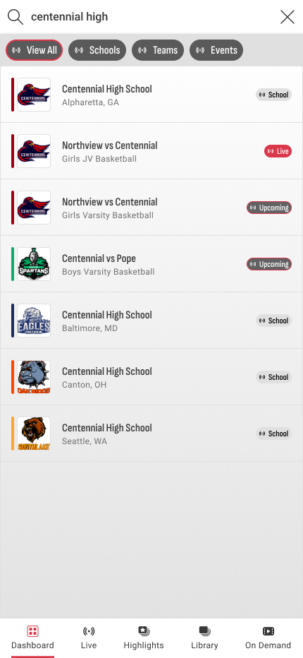
We experimented with several options for displaying categories on the dashboard. Each one had pros and cons, but we quickly came to the conclusion that everyone else wasn't wrong and we weren't going to fight it.
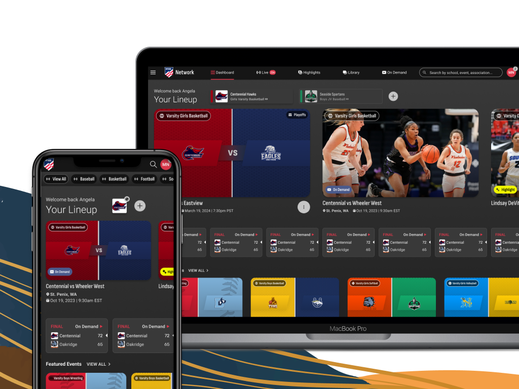
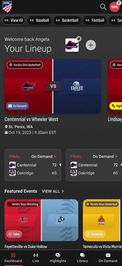
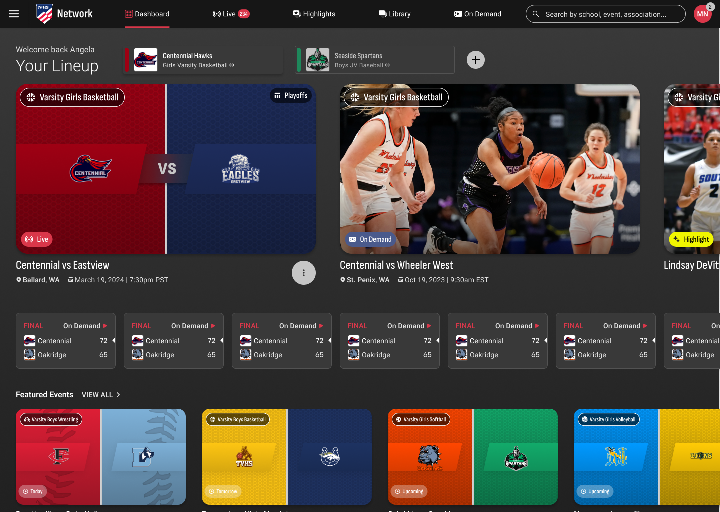
Unless you've been living under a rock under a whole 'nother planet, you've seen carousels used for streaming services. Every service from Netflix to Watch ESPN (a partner) uses carousels in their platform in some capacity. On mobile it is one of the more familiar ways to navigate content and on desktop it provides a clear and easy way to get from one category to another. It also allows us to keep the exploration experience almost 100% consistent from platform to platform no matter the device.