It's a design system starter thing

Pres Start

Myself

A personal learning project that grew into a whole fun thing of it's own

Role

Designer, Developer, Writer, Perpetual Student, AI Assisted

Skills & Tools

List below this time - twas a full project, ya know?

Project Background

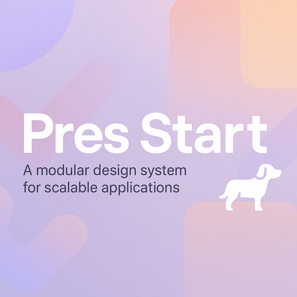
Pres Start began as a personal learning exercise — just me diving back into the fun front-end stuff like React, Vite, and Tailwind CSS. But as I iterated and added more structure, it quietly evolved into something more: a case study. And then I kept going… now it has its own AI-powered chatbot trained on the system, mostly as a learning experiment (for me, selfishly). It’s branded around my one-year-old Australian Shepherd, Presley. The whole thing is extremely serious, thank you.

What started as a sandbox became a system — a continuous work in progress and something genuinely useful (at least for me).

Designing and Building in Parallel

From the beginning, I treated Pres Start as both a design and development challenge. I designed the entire system in Figma with a focus on accessibility and customization. The component library, color palettes, tokens, and typography in the codebase are all mirrored from the Figma file — so designers can work in Figma just as developers do in code.

To bridge that gap even further, I built a custom color palette generator that outputs Tailwind-compatible design tokens. You plug in your brand color, and it generates a complete tokenized palette ready to drop into your project. That connection between visual design and implementation is a core principle of Pres Start — and one I’m continuing to build on.

so...

what is it?

This all started with a simple tutorial on building an AI/React component—and somehow turned into a full-on system with its own mascot. Happens to the best of us.

Figma Design SYstem

Every component and color is built in Figma too. Published on the Figma Community. You can use Tokens Studio to update the theme with your palette from the generator. Design and dev stay in sync.

Component Library

A full set of reusable, responsive, accessible UI components built with React and Tailwind. Buttons, navs, cards, tables, chatbot, and more.

color palette generator

Pick a base color, and it gives you a full tokenized palette with light/dark modes. Export to JSON and plug it into the system or Figma.

documentation site

Good design is consistent. Consistent design gets documented. That’s what all the big systems do, and Pres Start does too. The docs are a home base for the whole system—clear, friendly, and actually helpful, whether you’re designing or building.

presbot chatbot

An AI assistant trained on the design system itself. Powered by OpenRouter. It’s helpful, a little sassy, and speaks in Presley’s voice.

design tokens

Color tokens power both the site and the Figma system. Jump start it with the colors from the color palette generator.

why I built it

I wanted a playground to explore design systems deeply - across both design and development.
Not just how they look, but how they scale, how they get used, how they get shared. And I wanted to see how far I could take it by layering in AI: as a tool, as a co-designer, and even as a feature.
In addition to its ease of use, our website builder is also packed with features and tools to help you create a website that's not only beautiful but also functional.
Even side projects have rough drafts
Boom - Marketing

Pres Start Today!

Live Site

Check out the components, documentation, and talk with Pres.

Figma File

Grab the design file, toss in your color palette.

GitHub Repo

This will probably update... You can see all the commits, whew.
shoot me an email