Autosigma: Digital Marketing for Auto Dealerships
Product Designer
Prototyping (Figma, Storybook)
User Interviews
User Screen Capture
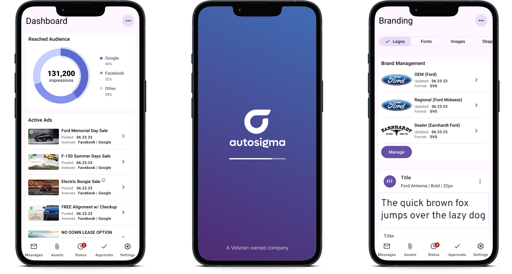
PureCars was the company behind this project, and they acquired AutoSigma to boost their digital marketing services. At its core, AutoSigma is a Digital Asset Management (DAM) platform built for car dealerships. It helps dealers and their agency partners quickly create, update, and deploy marketing materials across different channels, all from a central dashboard for monitoring and approval. Both salespeople and designers were using the platform, so we needed to strike the right balance between making it easy to use and offering enough high-level design options.
Our daily team was made up of the product owner, the lead engineer, and the lead graphic designer (who also doubled as a test user).
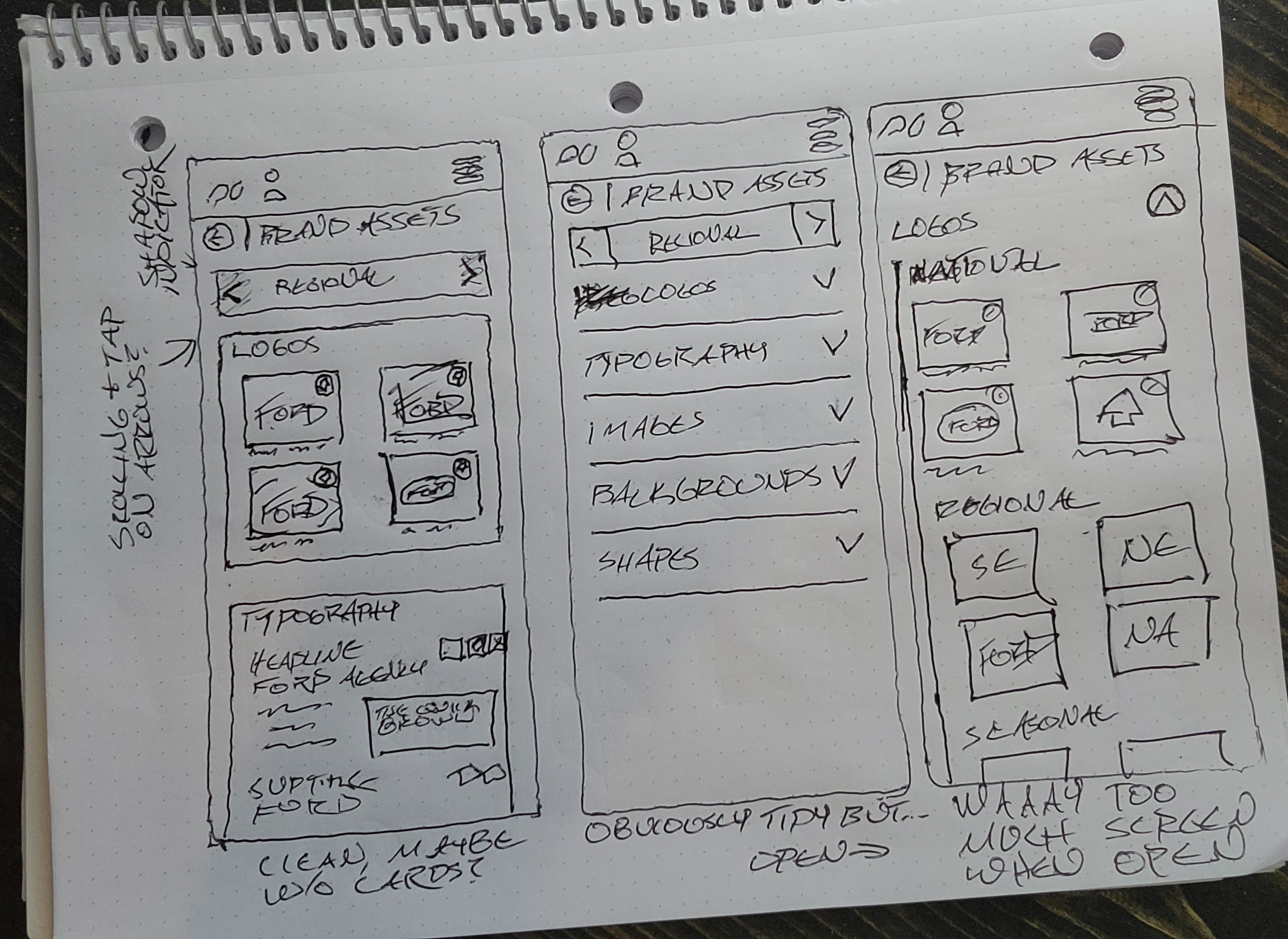
Working as the only designer on the team (well, UX designer at least), I put together all of the wireframes and screens for this project. Don't get me wrong - the team was beyond capable, helpful and we put some brilliant things together - but the pixel pushing was on me.
General Manager or Sales Manager, possibly Sales Associates
Graphic Designer at marketing company or in-house at larger dealer group
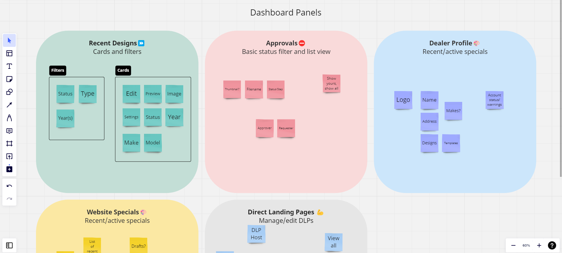
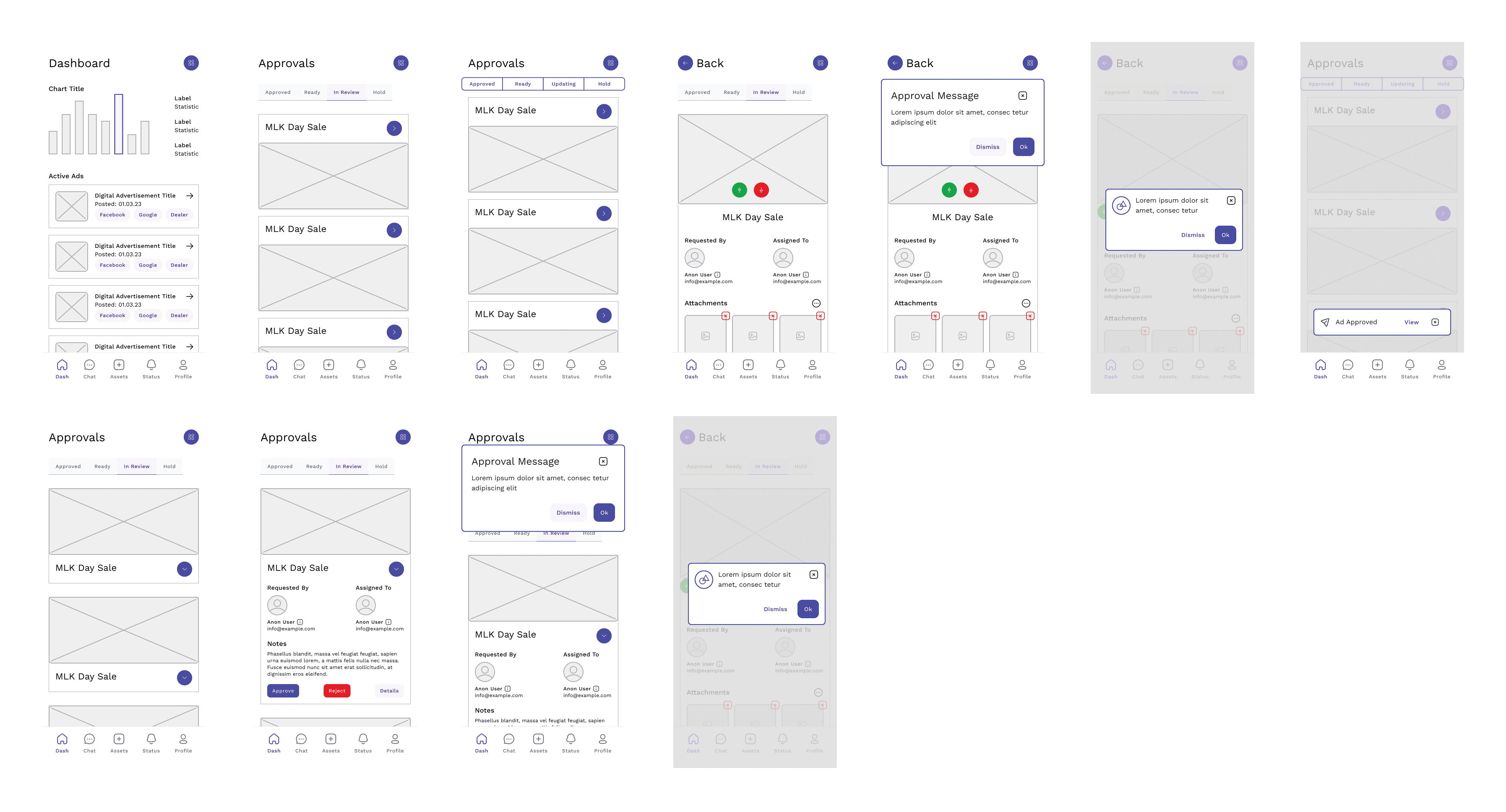
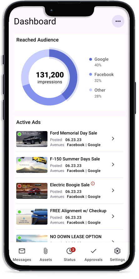
Dashboard
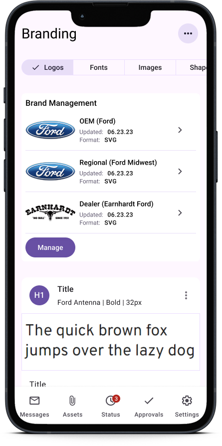
Brand Management
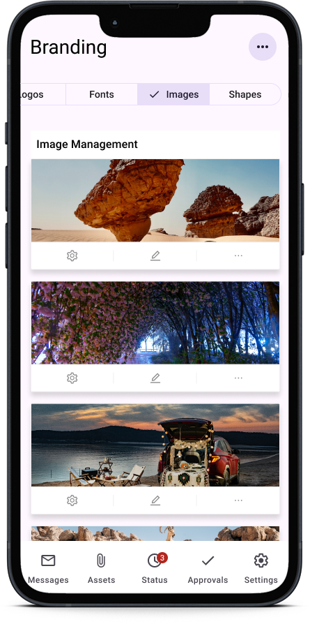
Asset Management