NAPA: e-Commerce Design System
NAPA
NAPA Online and all related apps and properties
Role
Product Designer
Skills & Tools
Design System (Figma)
Component Management (Storybook)

How It Started
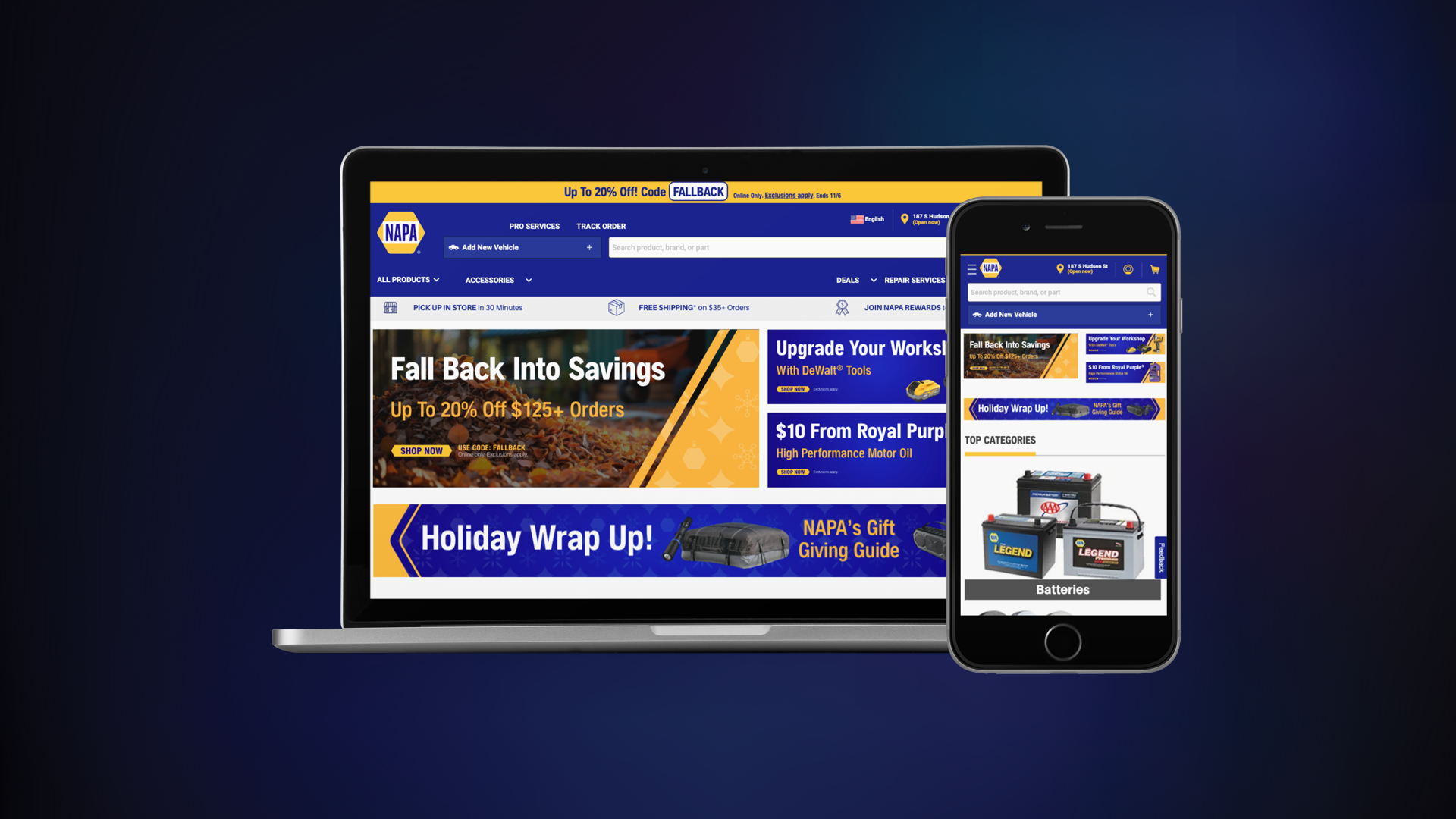
We were tasked with creating a design system for NAPA Online and all its connected user portals and applications. This design system would serve as the foundation for building out all the screens across the platform.
Now, “putting together a design system” is a pretty broad ask. For a massive, patchwork platform like this, our approach was to document every single atom, molecule, and component first. We worked on this alongside mapping out the new, optimized user flows we’d be using. That way, whenever a new component popped up during ideation, we could immediately add it to the working system.
Our core team included me (a UX Designer), a User Experience Researcher, and our Lead Software Engineer. We worked closely together to ensure everything stayed aligned.
Research
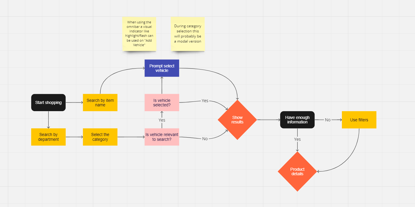
Once we had a solid list of the current pain points, we shifted our focus to understanding the app’s target users. We wanted to know how people were searching for products and what situations they might find themselves in while doing so.
We had access to user-testing screen recordings, which gave us some great insights, but we also conducted in-person interviews with shop owners and dealers from our beta-user program. Through this research, we identified a couple of key needs:
- Ease of use: Many users were on mobile, often in their cars or on the side of the road, so simplicity was critical.
- Speed for repetitive tasks: Shop owners and dealers performed the same actions over and over daily, so finding ways to speed those up was a top priority.
We also picked up on some interesting user behaviors:
- Most base users barely know what car they drive, let alone what engine it has.
- Base users are very often on mobile devices.
- Shop owners and dealers, on the other hand, almost always work on desktops.
This research helped us frame the direction for our design work.
During our brainstorming sessions (whiteboards, Miro boards, the works), we identified the big problems we wanted to solve. One was the lack of consistency, and another was improving search functionality for those base users who often had no idea what they were looking for. We also started defining the components and screens that would become the foundation of our design system.
On top of that, we wanted to make those repetitive tasks for shop owners and dealers feel less repetitive. Little improvements can go a long way when it comes to daily workflows!

Design System
Figma Tokens (Now Variables) Are Awesome
Placement
- all
- vertical
- horizontal
- top
- right
- bottom
- left
Sizes
- xxs – 2px
- xs – 4px
- s – 8px
- m – 16px
- l – 24px
- xl – 32px
- xxl – 48px
Variables in Figma Design store reusable values that can be applied to all kinds of design properties and prototyping actions. They help save time and effort when building designs, managing design systems, and creating complex prototyping flows.
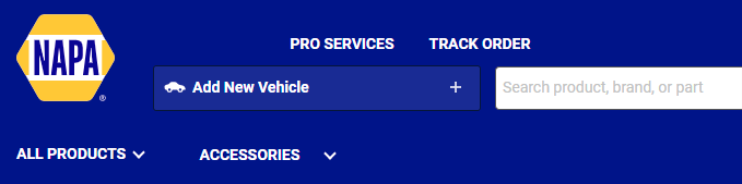
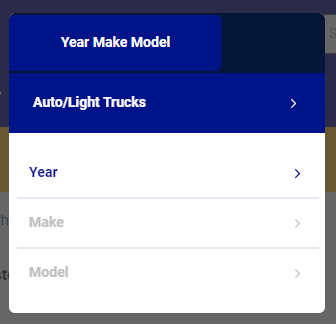
FigmaResearching the Search
Saved Vehicles
Design Handoff

Components
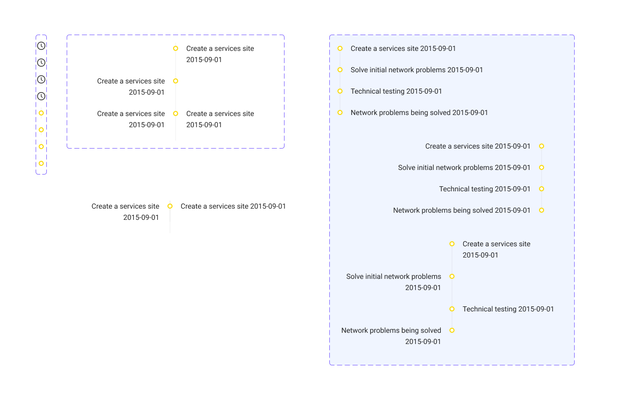
The timeline component, used for delivery, tracking, etc.


Reflections
With A Great Team Comes Great Improvement
There’s no glossing over the fact that this project was huge. NAPAonline did over $270m in sales in 2022 using this design system. That was up 30% from 2021, which is obviously great. However the big news here was that growth in sales was generated by roughly the same number of visitors! There was a slight YOY growth in that number, but our conversion rate for those consumers was up ~37% from the previous year.